BACK
BookinGuru
Digital concierge partner
UX/UI, Design System

Overview
BookinGuru is a digital concierge service for premium hotels.
It started in Ibiza as a yacht rental platform and gradually expanded into a complete experience-booking ecosystem: transfers, car rentals, club tickets, tours, outdoor activities, and more.
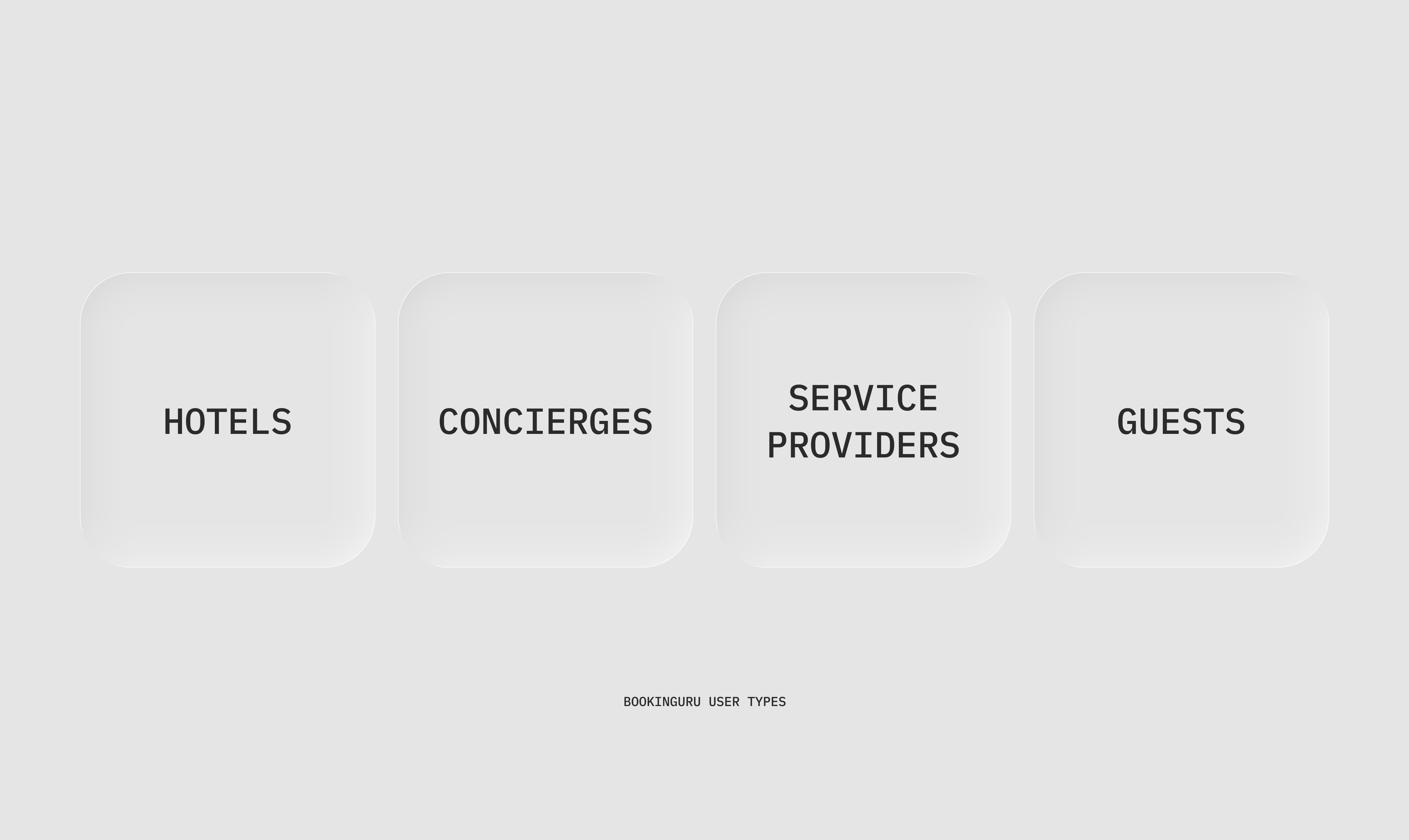
Today, it connects three main groups — service providers, hotel concierges, and guests — allowing them to book and manage experiences in one place.
Guests can browse curated catalogs, make direct bookings, or request a concierge to arrange everything for them.
The Challenge
By the time I joined, the product had grown fast across 12 different verticals, but the design foundation hadn’t kept up.
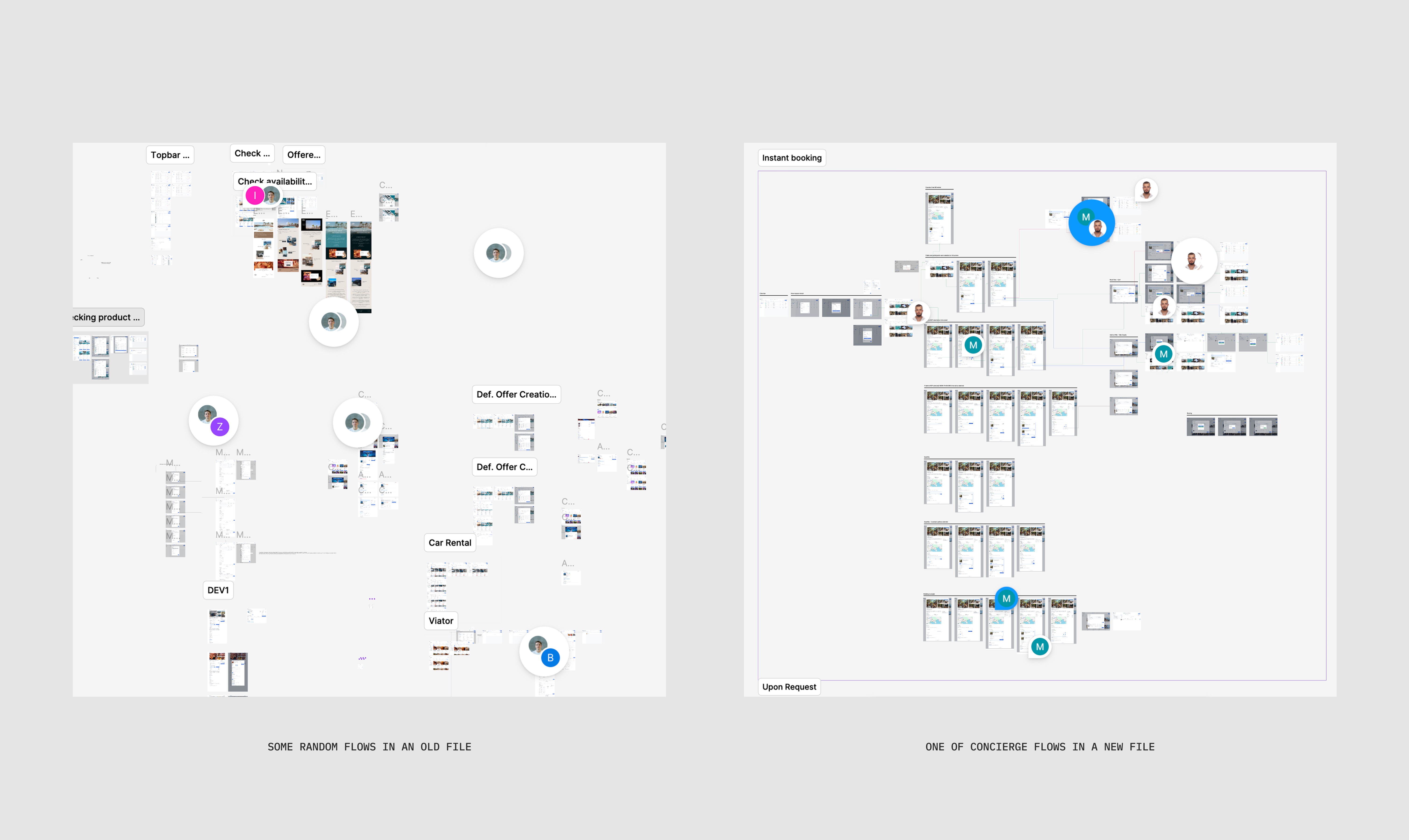
The Figma file was almost unusable — bloated, inconsistent, and painfully slow.
The previous designer had used an external design system that was outdated and poorly aligned with BookinGuru’s real use cases.
Developers were frustrated by mismatched components and missing states.
Concierges needed live training to complete basic actions like creating or modifying bookings.
Service providers struggled to add their listings correctly, which meant missed revenue for both hotels and the platform.
The lack of design structure and poor UX caused operational friction, user confusion, and direct business loss.
My Role
I joined as the only product designer on the team, replacing the previous one.
I worked directly with the CEO, who was constantly in touch with concierges and hotels, as well as a business analyst and developers.
My task was to bring clarity back — to rebuild the design system, clean up the design operations, and redesign key user flows so they reflected how people actually used the platform.
The goal wasn’t to “make it pretty.” It was to make the product stable, scalable, and profitable again.
Process
1. Understanding the System
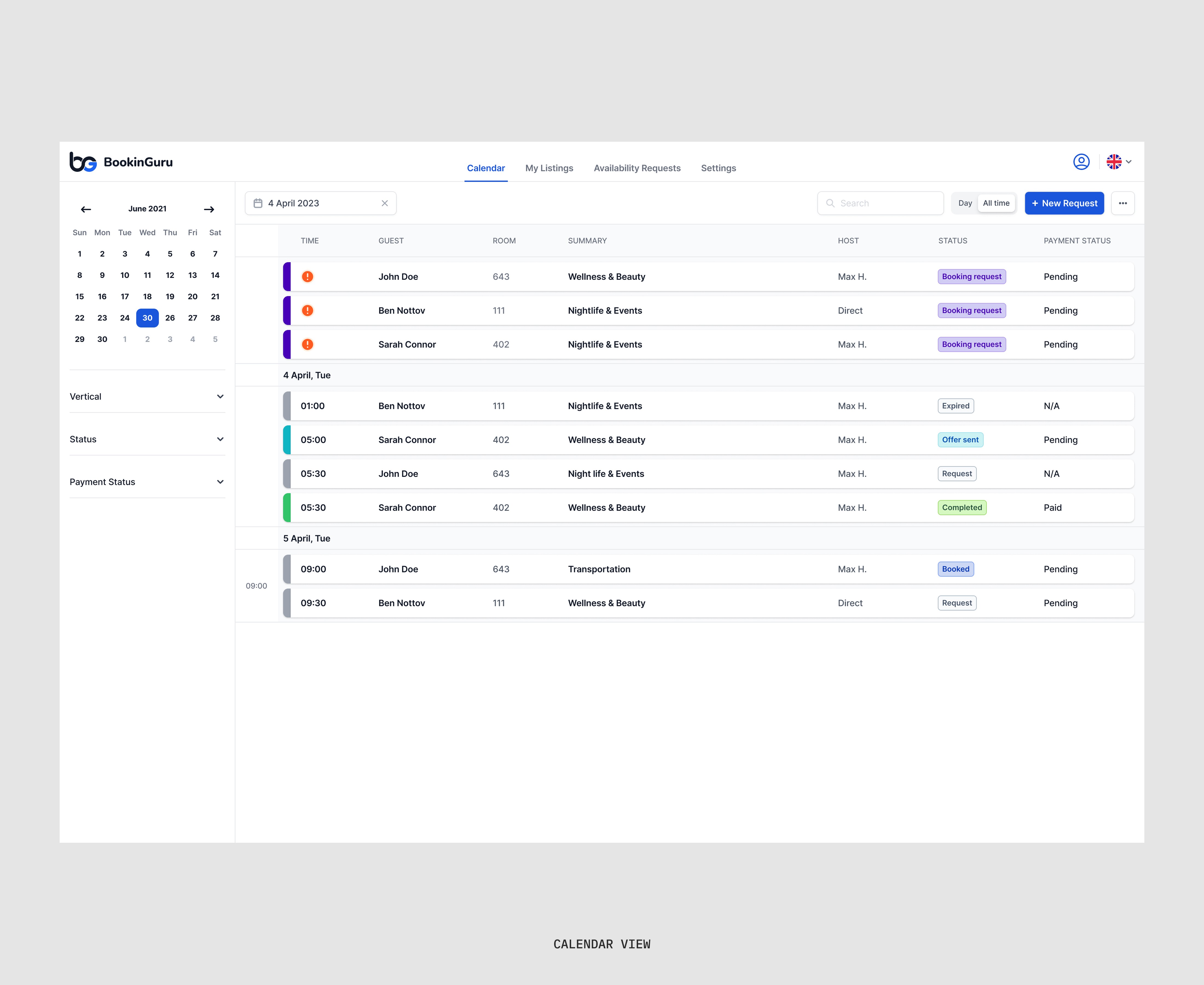
I started by mapping every major user flow with the business analyst. BookinGuru has many layers — a calendar for concierges, service listings for providers, custom catalogs for hotels, and booking dashboards for guests.
I spent the first weeks testing each flow as if I were a user, taking notes on where the logic broke or repeated.
2. Rebuilding the Design System
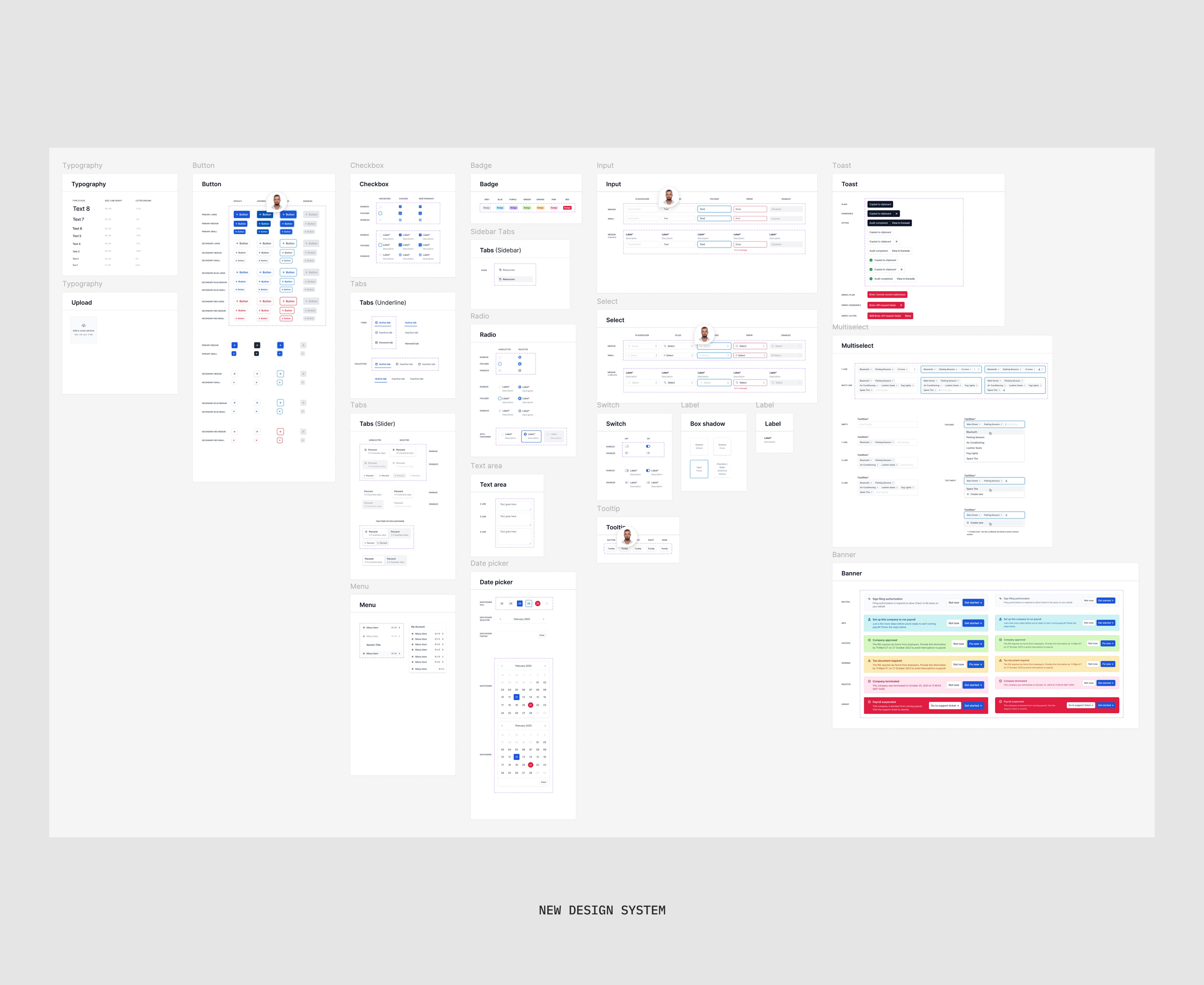
Once I understood the ecosystem, I created a new Figma file from scratch.
I designed a fresh component library and established structure, naming, and versioning rules.
I also introduced a system for managing design updates — every new feature and screen was now built on the same source of truth, with annotations for developers.
This instantly reduced confusion and rework.
3. Redesigning Core Flows
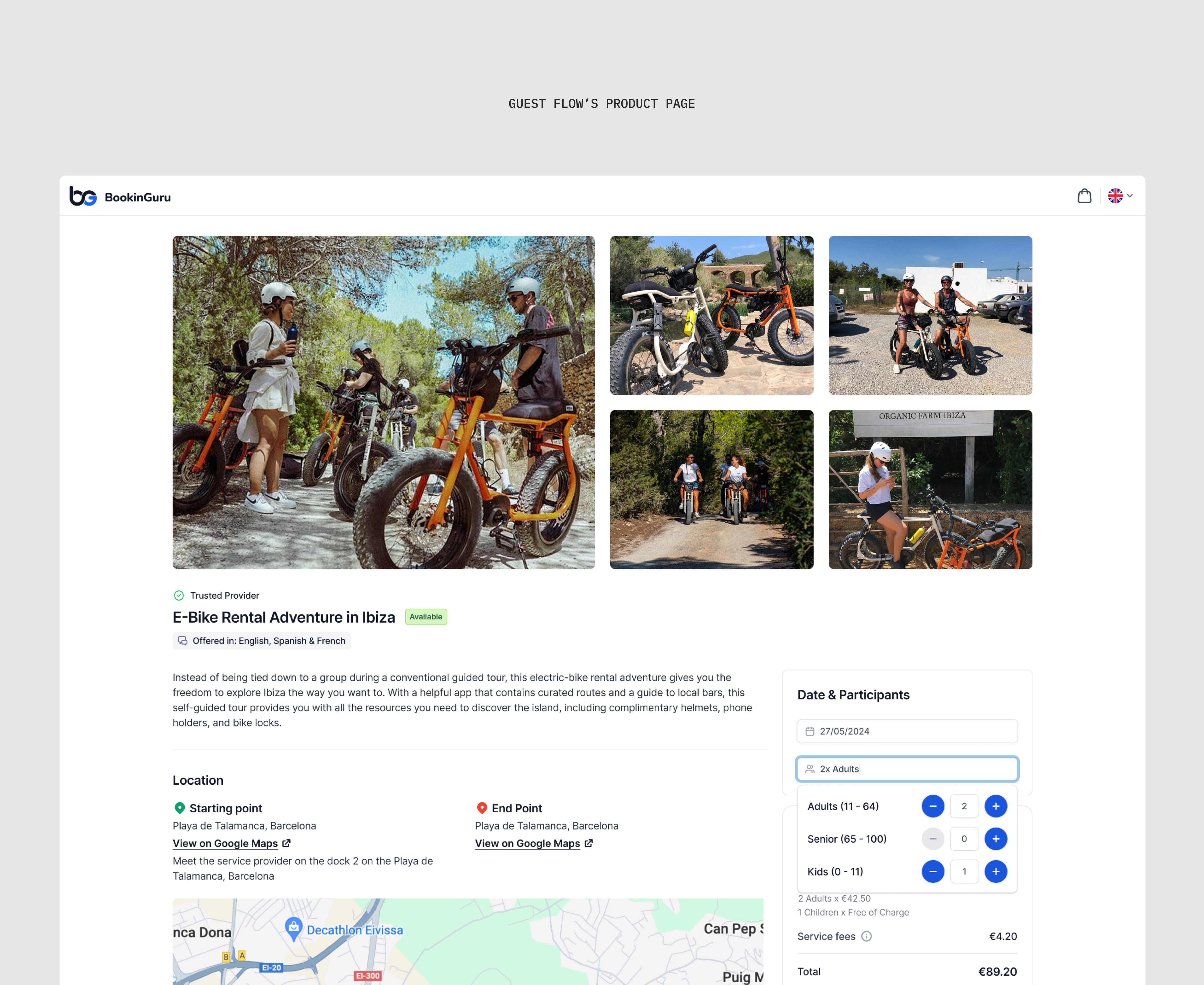
The product’s logic varied wildly across verticals. Booking a yacht, a car, and a spa visit all had different data requirements — but the experience needed to feel unified.
I redesigned the guest booking flow from scratch so it could adapt dynamically to any vertical while keeping one consistent structure.
Some of the things I worked on:
Added a review system to increase trust and transparency.
Rebuilt the concierge flow: from calendar → new offer → add guest → pick services → share itinerary.
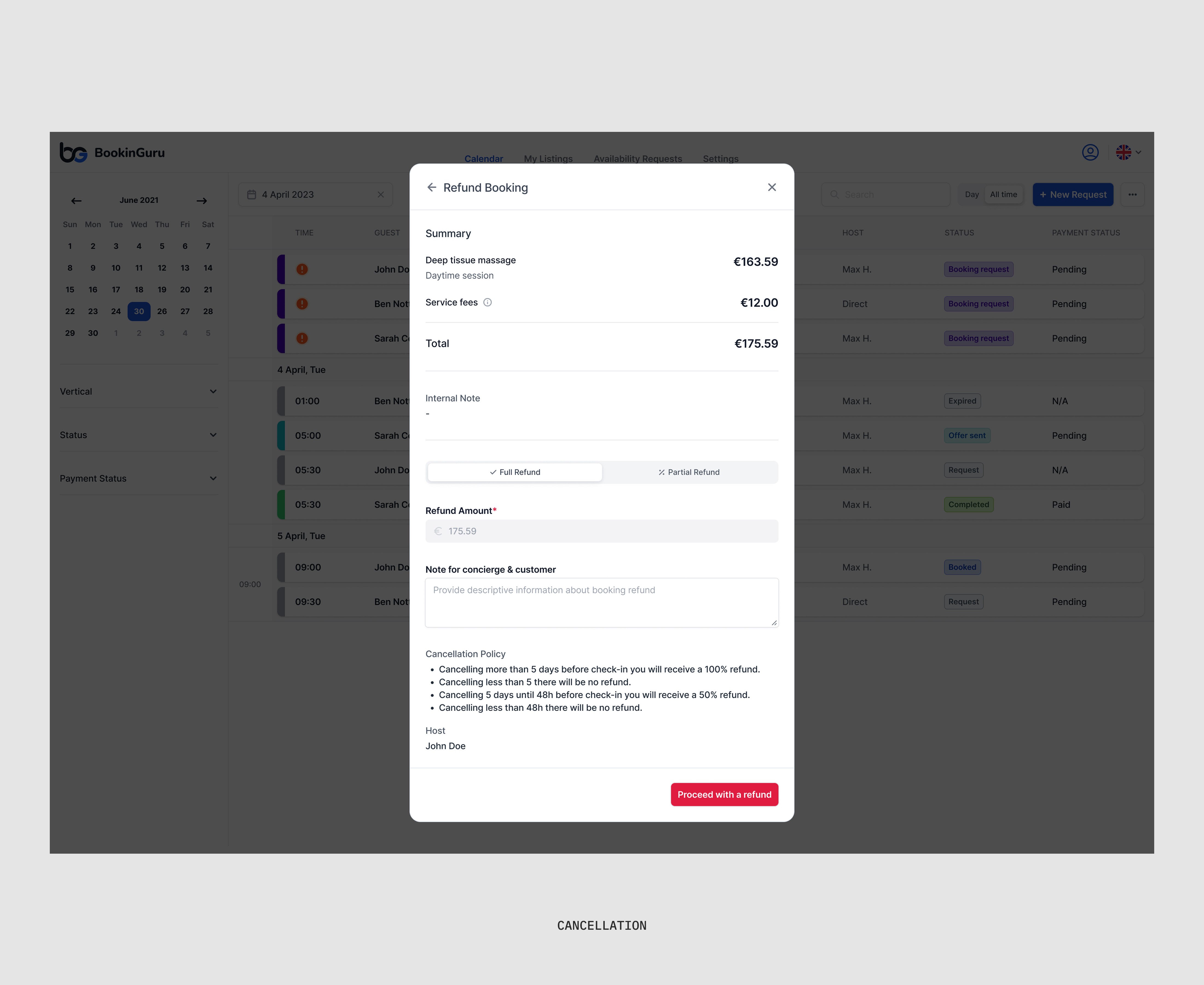
Introduced booking cancellation flow with money-back logic for different service types.
Created a draft mode for long service listing forms.
Allowed hotels to create private listings visible only to their guests.
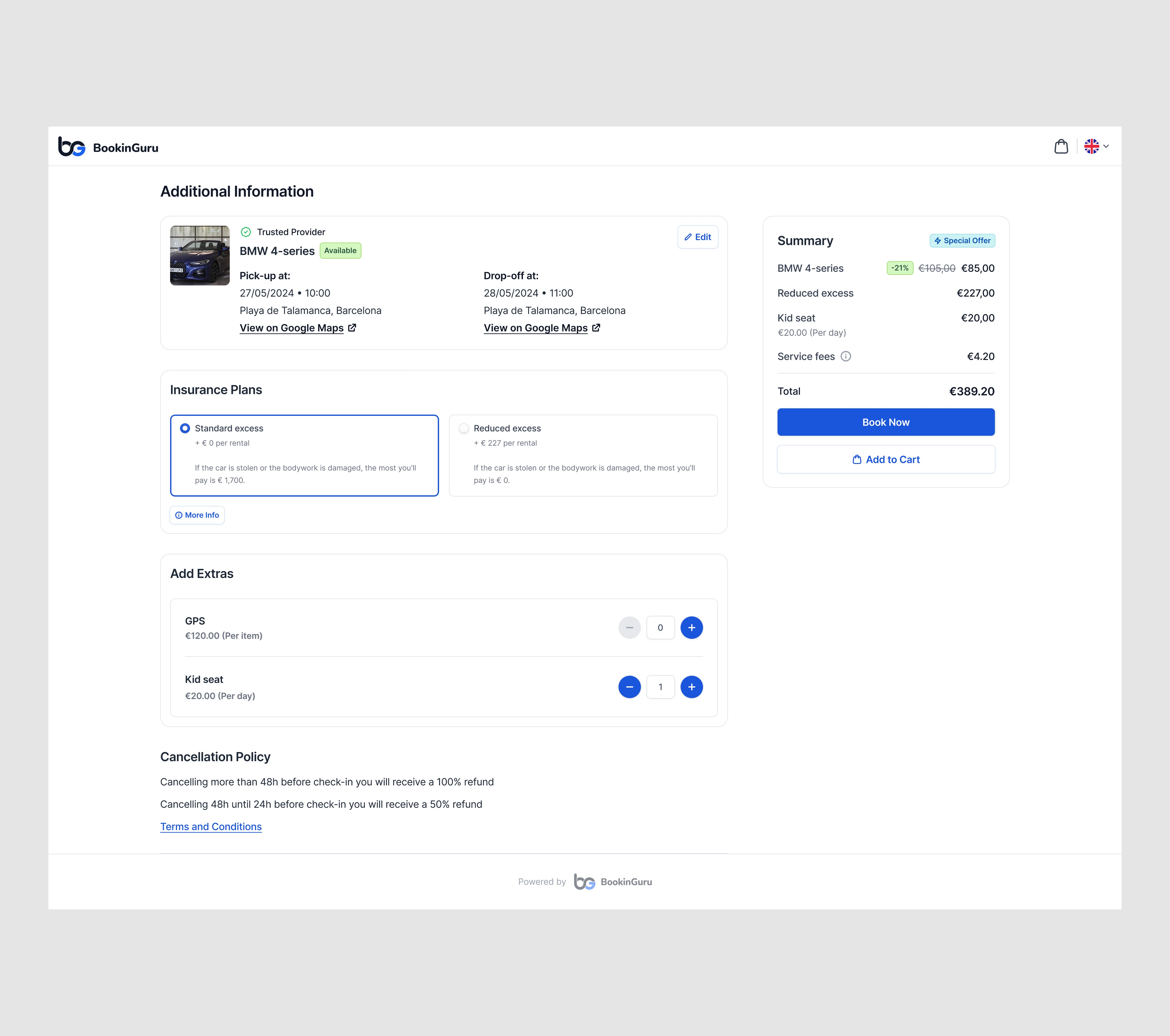
Designed multilingual tour support and car-rental insurance handling.
Each feature was scoped to balance user needs with developer capacity — we had to design smart, not heavy.
4. Collaborating Closely with the Team
Communication was everything.
We had weekly product syncs with the CEO and business analyst to review user feedback from hotels and concierges.
Developers were part of the design review cycle. Every major flow came with notes and handoff sessions.
This closed the loop between design, dev, and business — something the product had never had before.
Challenges
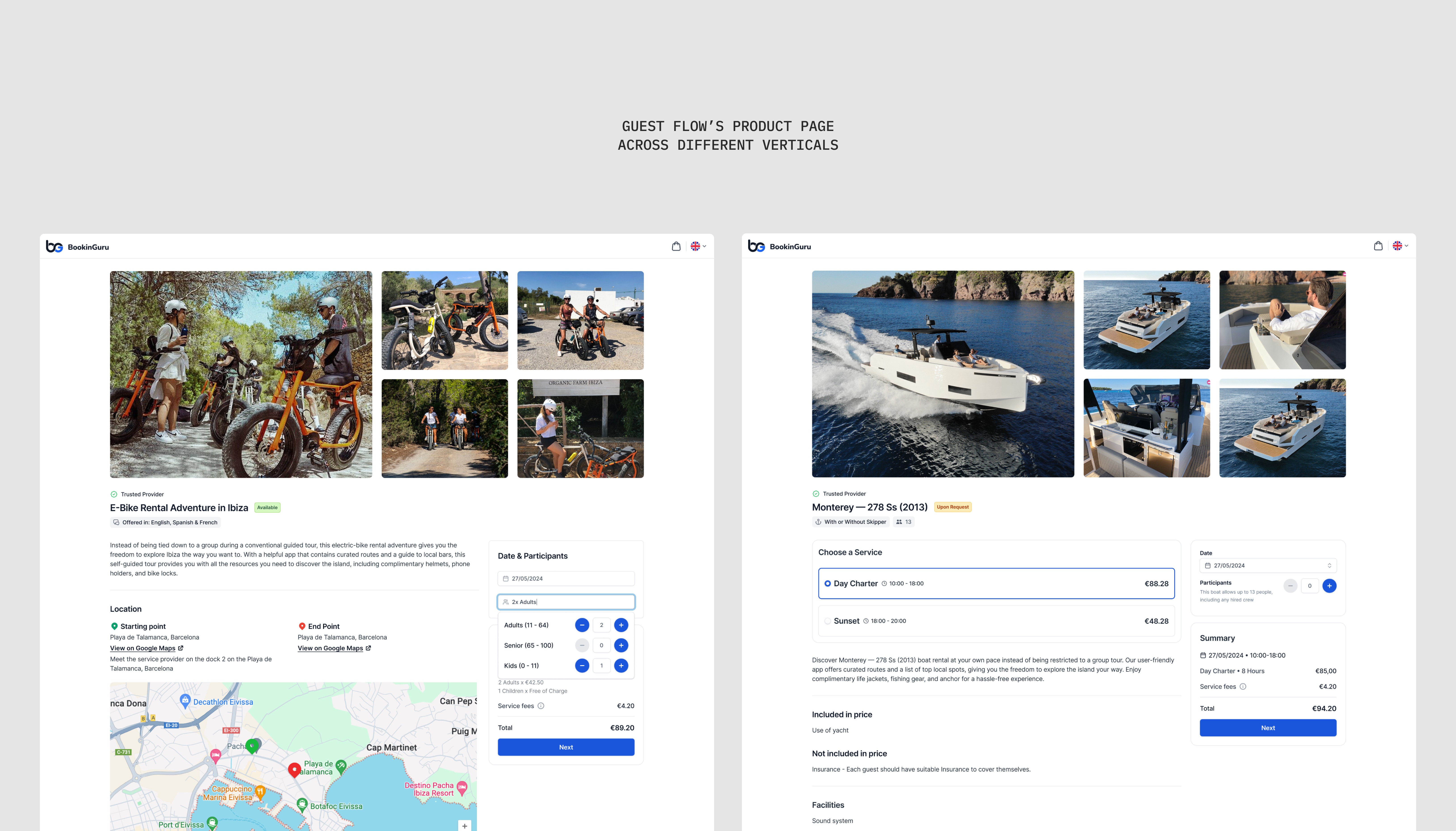
One of the toughest challenges was UX consistency across 12 service verticals.
Each had unique requirements, but the guest or concierge shouldn’t feel like they’re switching between separate apps.
Design decisions had to strike a balance: flexible enough for complex data, but simple enough for real-time bookings under pressure.
Results
Developer confusion dropped almost completely — handoffs became smooth, questions rare.
The new design system drastically improved collaboration and implementation speed.
Bugs and UX issues decreased; new features shipped faster.
Concierges required significantly less onboarding time.
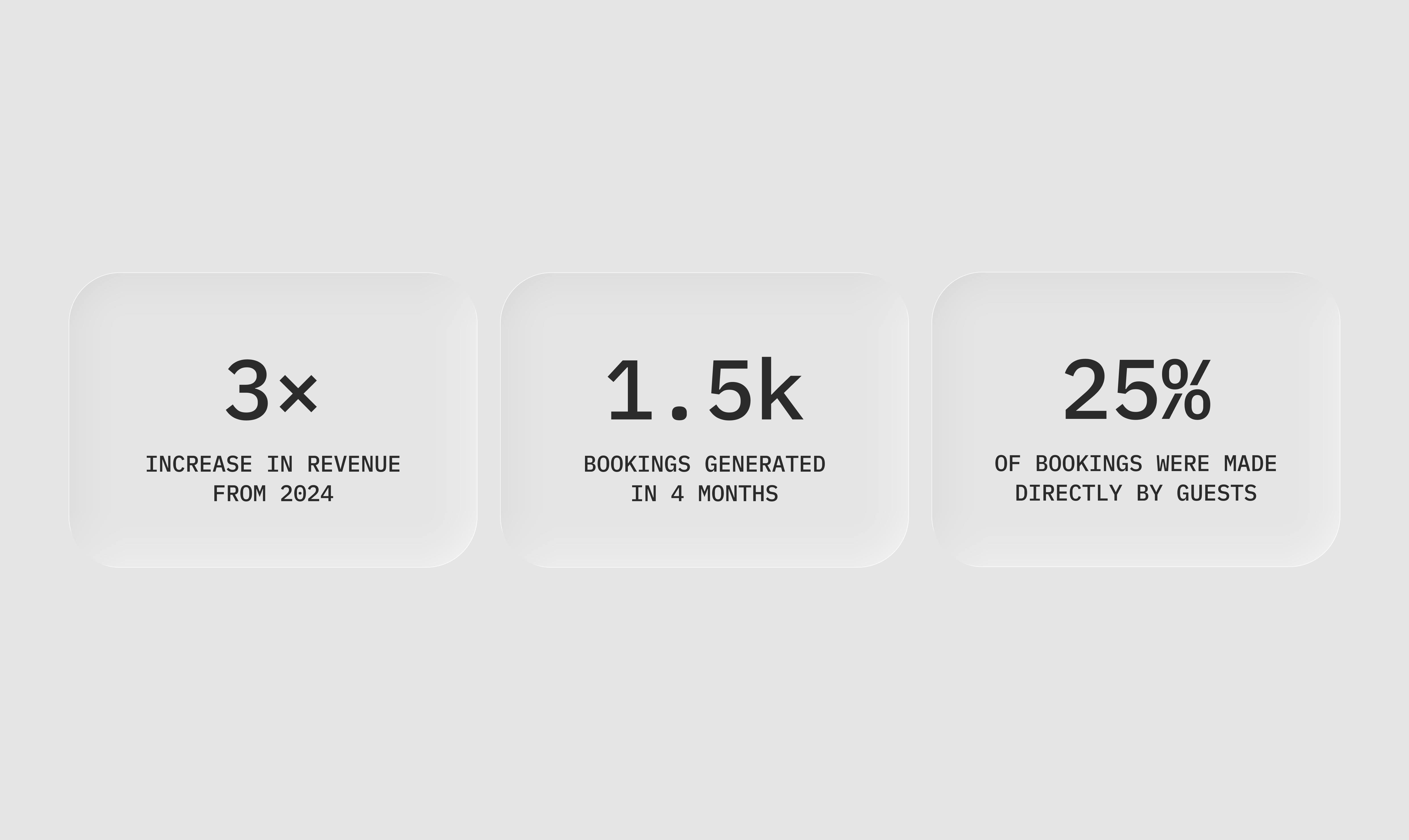
Guests started booking directly more often — 25% of all bookings now happen without concierge assistance.
Over 1,500 bookings were made in the last four months.
Platform commission revenue grew 3× year-over-year after these design changes.
The CEO and the hotels reported noticeably higher satisfaction with both usability and visual polish.
Reflection
This project taught me how to balance product depth with operational simplicity.
Rebuilding an existing product isn’t about deleting what’s broken — it’s about understanding why it broke, and designing around that reality.
BookinGuru went from a fragile, confusing tool to a robust, multi-vertical platform that both users and developers actually enjoy working with.